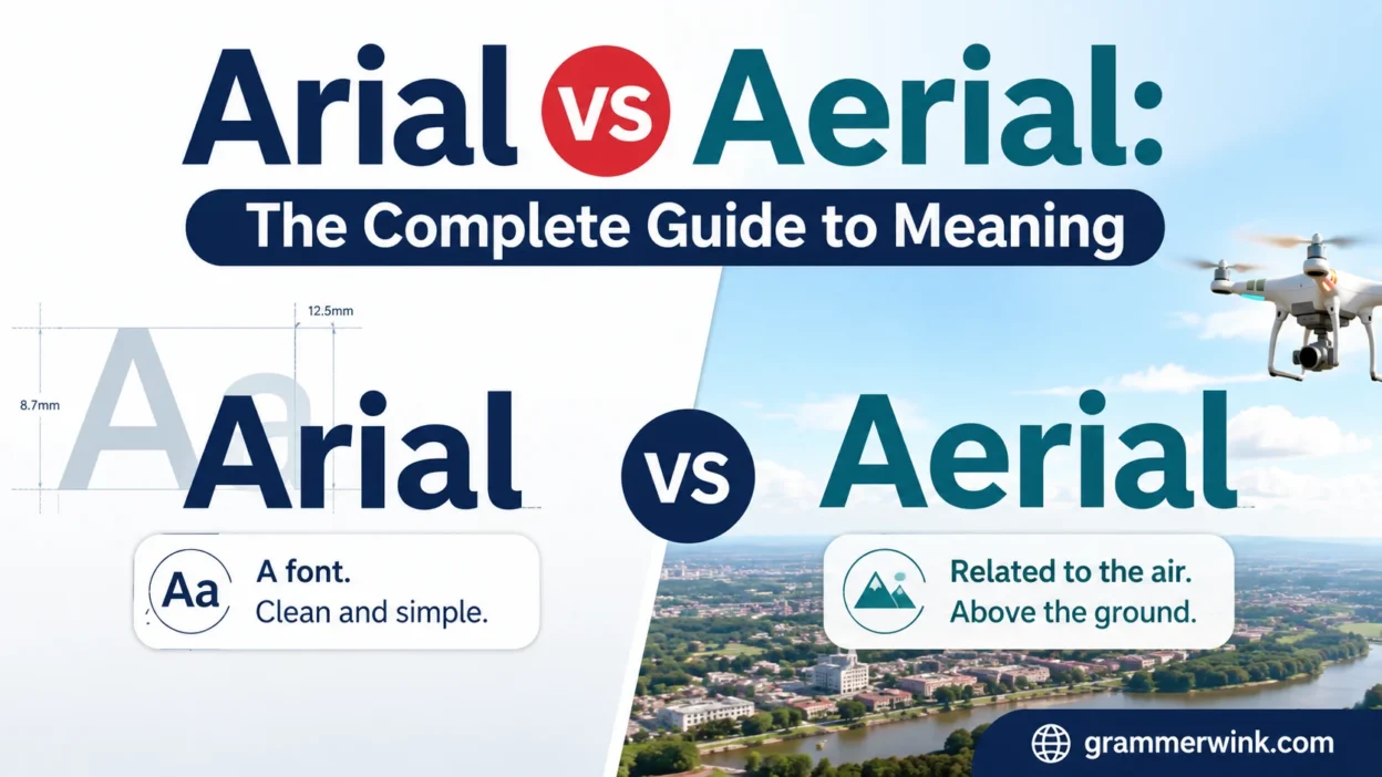
When learning English, similar-looking words can often create confusion and mistakes in everyday writing. The words Arial and Aerial may look or sound similar, but they have very different meanings. Arial is mainly associated with a popular font style used in documents, websites, presentations, and designs. On the other hand, aerial usually refers to air, aircraft, height, or something seen from above. Understanding this important word difference can help you communicate more clearly and accurately. Whether you’re discussing fonts, photography, aviation, or landscapes, choosing the right word is essential.
The word Arial is commonly used when talking about fonts and typography. It is a sans-serif typeface recognized for its clean, simple, and readable appearance. You may find Arial font in documents, emails, websites, presentations, and various digital designs. The word aerial, however, describes something connected with the air or atmosphere. For example, an aerial photograph captures an image from above, often using an aircraft, helicopter, or drone. An aerial view can also show cities, roads, buildings, or landscapes from a higher perspective.
In this complete guide, we’ll explain the meaning, pronunciation, usage, and key differences between Arial and Aerial. You’ll learn through simple explanations and examples how to recognize the correct word in different situations. We’ll also discuss common mistakes that can happen when these confusing words are used incorrectly. A helpful way to remember the difference is to connect Arial with fonts and aerial with air or above. Once you understand these simple associations, choosing the correct word becomes much easier. By the end, you’ll feel more confident and accurate when using Arial vs Aerial in your writing.
What is Arial? (Understanding the Arial Font in Detail)
Arial is a widely used sans-serif typeface designed for clarity and readability. Designers and office workers rely on it daily because it stays clean across screens, documents, and print.
It is not just “a font.” It is one of the most influential digital typefaces in modern computing history.
Where Arial came from
Arial was designed in 1982 by Robin Nicholas and Patricia Saunders at Monotype Typography. It was originally created as a practical alternative to Helvetica, which was popular but expensive to license.
The real turning point came in the early 1990s.
When Microsoft bundled Arial with Windows 3.1 (1992), it instantly became one of the most widely distributed fonts in the world. That move made Arial a default choice for millions of users.
Key characteristics of Arial
Arial stands out because it focuses on readability over decoration.
Here’s what defines it:
- Clean, modern sans-serif design
- No decorative strokes (unlike serif fonts like Times New Roman)
- Balanced spacing for screen readability
- Neutral tone that fits almost any context
- High legibility at small sizes
Think of Arial as the “plain white T-shirt” of fonts. It doesn’t try to impress you. It just works.
Where you see Arial every day
Arial appears almost everywhere, often without you noticing:
- Microsoft Word documents
- PowerPoint presentations
- Business reports
- Government forms
- Early website designs
- PDFs and resumes
Even today, many systems still default to Arial because it loads reliably across devices.
Why Arial became so popular
Arial grew because it solved a simple problem: readability and compatibility.
A few reasons behind its dominance:
- It shipped with Windows systems globally
- It required no extra installation
- It displayed consistently across screens
- It replaced expensive fonts like Helvetica in many workflows
In short, Arial became the “safe choice” font for decades.
What is Aerial? (Real Meaning and Everyday Uses)
Unlike Arial, aerial is not a font. It is a descriptive word.
Aerial refers to anything related to the air, atmosphere, or things viewed from above.
It comes from the Latin root aerius, meaning “of the air.”
Core meaning of aerial
At its simplest:
Aerial = something happening in or seen from the air
It describes perspective, movement, or objects connected to flight or height.
Common uses of aerial in real life
You’ll see “aerial” in several practical contexts:
Aerial photography
Images taken from above using drones, helicopters, or aircraft.
Example:
- Drone capturing a wedding from the sky
- Helicopter filming a football stadium
- Satellite-style images of cities
Read More: Christmas, Christmases, or Christmas’s: A Complete Grammar
Aerial view
A perspective looking down from above.
Example:
- Real estate listings showing top-down house views
- Maps showing traffic patterns
- City planning visuals
Aerial acrobatics
Gymnastic or circus movements performed in the air.
Example:
- Silk rope performances in circuses
- Gymnasts performing flips on bars
Aerial antennas
Equipment used to receive or transmit radio and TV signals.
Example:
- TV rooftop antennas
- Communication towers
Simple idea to remember
Think of “aerial” as anything that involves air or height.
If it’s up in the sky or related to airspace, it’s aerial.
Arial vs Aerial: The Core Differences Explained Clearly
Now let’s bring both terms side by side.
They differ in meaning, usage, and even category.
Comparison table: Arial vs Aerial
| Feature | Arial | Aerial |
| Category | Typeface (font) | English adjective |
| Field | Design, typography | Photography, aviation, language |
| Meaning | A font style used in writing | Related to air or sky |
| Usage example | “Use Arial for the report” | “Aerial drone footage of the city” |
| Origin | Designed in 1982 by Monotype | Derived from Latin aerius |
| Context | Digital documents and UI | Sky, flight, altitude, visuals |
The simplest difference
- Arial = something you read
- Aerial = something you see from above
That one-line distinction clears up most confusion instantly.
Why Arial vs Aerial Confusion Happens So Often
This mix-up happens more often than you might think. Even experienced writers sometimes slip.
Let’s break down why.
Similar spelling
The only difference is one letter:
- Arial
- Aerial
That small change makes a big difference in meaning.
Similar pronunciation
In fast speech, both words sound nearly identical. That makes hearing-based confusion common.
Autocomplete mistakes
Search engines often guess wrong when users type:
- “aerial font”
- “arial drone”
- “aerial word font”
The system tries to “help,” but it often mixes contexts.
Lack of context
People usually type short queries. Without context, the brain fills in the wrong assumption.
Example:
- A student searching for “aerial style” might actually want “Arial font style”
How to Remember Arial vs Aerial Easily
You don’t need a linguistics degree to avoid confusion. A few memory tricks solve it fast.
The “Air” trick
- Aerial = Air
- Anything in the air counts
Example:
- Aerial view = view from the sky
- Aerial drone = drone in the air
The “Alphabet” trick
- Arial = A for Alphabet
- Fonts belong to text and writing
Example:
- Arial = writing system
- Aerial = flying system
Visual association method
Your brain remembers images better than words:
- Arial → text on a screen
- Aerial → drone flying over a city
Quick cheat sheet
- If it appears in Word or design software → Arial
- If it appears in photography or aviation → Aerial
Common Mistakes People Make (and Why They Matter)
These errors show up everywhere from school assignments to marketing campaigns.
Mistake 1: “Aerial font”
This is the most common mistake.
Correct version:
- Arial font
Wrong version:
- Aerial font
Mistake 2: Mislabeling design files
Designers sometimes label assets incorrectly:
- “aerial-report.pdf” instead of “arial-report.pdf”
This creates confusion in teams and file systems.
Mistake 3: Marketing errors
Businesses sometimes misuse “aerial” when describing typography.
Example:
- “Download our aerial templates” ❌
- “Download our Arial-based templates” ✔
Mistake 4: keyword confusion
Content creators often target the wrong keyword mix, which hurts rankings.
When to Use Arial (Practical Real-World Guidance)
Arial works best when readability matters more than personality.
Best use cases for Arial
- Business reports
- Academic documents
- Government forms
- Website body text (neutral design systems)
- Presentations
Why designers still use it
Arial performs well in:
- Small text sizes
- Low-resolution screens
- Cross-platform compatibility
Example scenario
Imagine you’re preparing a corporate proposal.
You choose Arial because:
- It looks clean
- It doesn’t distract
- It prints clearly
It acts like a “silent helper” behind your content.
When to Use Aerial (Real-World Applications)
Aerial appears in visual, spatial, and creative contexts.
Best use cases for aerial
- Drone photography
- Real estate imagery
- Travel videos
- Sports broadcasting
- Geographic mapping
Why aerial content matters today
Aerial visuals provide:
- Better spatial understanding
- Strong storytelling angles
- Unique perspectives
- Marketing appeal
Example scenario
A real estate agent uses aerial footage to show:
- Roof condition
- Neighborhood layout
- Property boundaries
That perspective increases buyer trust.
Perspective: Why Arial vs Aerial Matters Online
This keyword confusion creates real digital opportunities.
High search intent overlap
People searching for:
- “Arial font download”
- “aerial font style”
- “aerial writing font”
often mean the same thing: Arial font.
Traffic opportunity
Content that clearly separates both terms can:
- Capture typo-based searches
- Reduce bounce rate
- Improve dwell time
Common strategy insight
Websites that explain confusion topics like this often rank well because they:
- Solve ambiguity
- Match real user intent
- Improve clarity signals for search engines
Quick Reference Summary
Let’s lock it in.
One-line definitions
- Arial: A sans-serif font used in documents and design
- Aerial: Anything related to air or viewed from above
Fast comparison
- Arial = text
- Aerial = sky
Simple rule
If it involves writing, it’s Arial.
If it involves flying or height, it’s aerial.
FAQs
Is Arial the same as Aerial?
No. They have completely different meanings. One is a font. The other describes air-related things.
Why do people confuse Arial and Aerial?
They look and sound similar, especially in fast typing or speech.
Is Arial a word or a font?
Arial is a font designed for digital and print typography.
What does aerial mean in simple terms?
It means something related to air, height, or a view from above.
Can aerial ever refer to typography?
No. If you see “aerial font,” it’s almost always a mistake for “Arial font.”
Final Thoughts
Once you understand the difference, the confusion disappears quickly.Arial stays grounded in text, documents, and design systems. Aerial lives in the sky, in photography, aviation, and perspective.One belongs to what you read. The other belongs to what you see from above.And now, you won’t mix them up again.